The moment has come: your brand needs new outdoor signage, which means 1 or 10.000 new items. But, no matter the amount, there are basics you want to be sure are covered before you give the green light for production. If these points are "forgotten", it could significantly impact your brand experience. This blog highlights the top dos of effective outdoor signage design in 2024 and tips for extras to make your signage a tad more exclusive.
Bitesized Summary (for people on-the-go): 5 key takeaways from the blog on effective outdoor signage design.
- Keep outdoor signage simple, easy to read, and with a clear color scheme.
- Use high-quality materials that are durable and weather-resistant.
- Integrate sustainability by using eco-friendly materials, LED lighting, and modular signage systems.
- Incorporate interactive elements and carefully consider the placement of the signage for maximum visibility and impact.
- Ensure accessibility for all potential customers, including those with disabilities, through features like braille and high-contrast colors.
1. Outdoor brand visibility: what keep it simple means.
Being outdoors means potential customers, visitors, and pedestrians will view your signage from different distances and angles. To make sure you're noticed, focus on making the sign easy to read by using large, bold fonts and a simple color scheme is easy on the eyes and clear. Also, avoid clutter on the sign for the same reason using a less-is-more approach. Pro tip: work with high-contrast, simple colors to ensure your sign pops out at any location while staying close to the 'easy-on-the-eyes' mantra (except if you're going for intense fluorescent shades).
.jpg?width=7410&height=4168&name=Brewdog%20Outdoor%20Sign%20V6-1920x1080%20ratio%20-%20High%20resolution%20(1).jpg) Brewdog Outdoor Sign by Dekkers
Brewdog Outdoor Sign by Dekkers
2. A resistant brand builder: the high-quality factor at all touchpoints.
Ensuring you invest in high-quality products has practical benefits but is also a critical influencer for brand perception. As your outdoor signage reflects your brand, consider investing in high-quality materials that will stand the test of time. And we are assuming, you don't want potential customers to see your brand sign missing some bits and pieces. Weather-resistant materials like metal, vinyl, or acrylic are also durable and can withstand harsh weather conditions which is something to consider no matter which sunny location your signage will shine. The bonus? High quality means less maintenance and longer product life.
 Swinckels' Outdoor Sign by Dekkers
High-quality is also relevant for design choices. High-quality graphics make your outdoor signage appear professional and appealing, so there are no cutting corners there. Download our full portfolio of 100+ designs to see what impact high-quality signage has on you.
3. Maximizing signage visibility while minimizing environmental impact
Whether your role is in commerce or branding, sustainability is the essential criterion for future-friendly product choices and affects all aspects of marketing. Brand builders can reduce the environmental impact of their outdoor signage by choosing sustainable materials and designing signs that can be reused or repurposed, contributing to a circular economy.
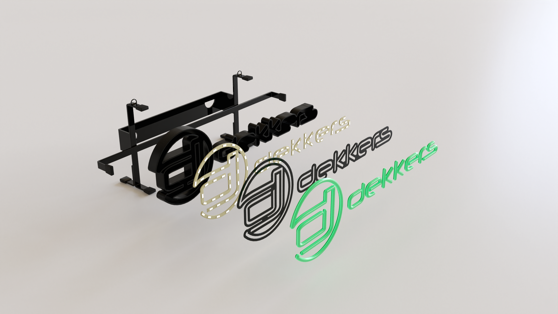
 Dekkers 3rd. Generation LEDNeon: recycled materials & modular design
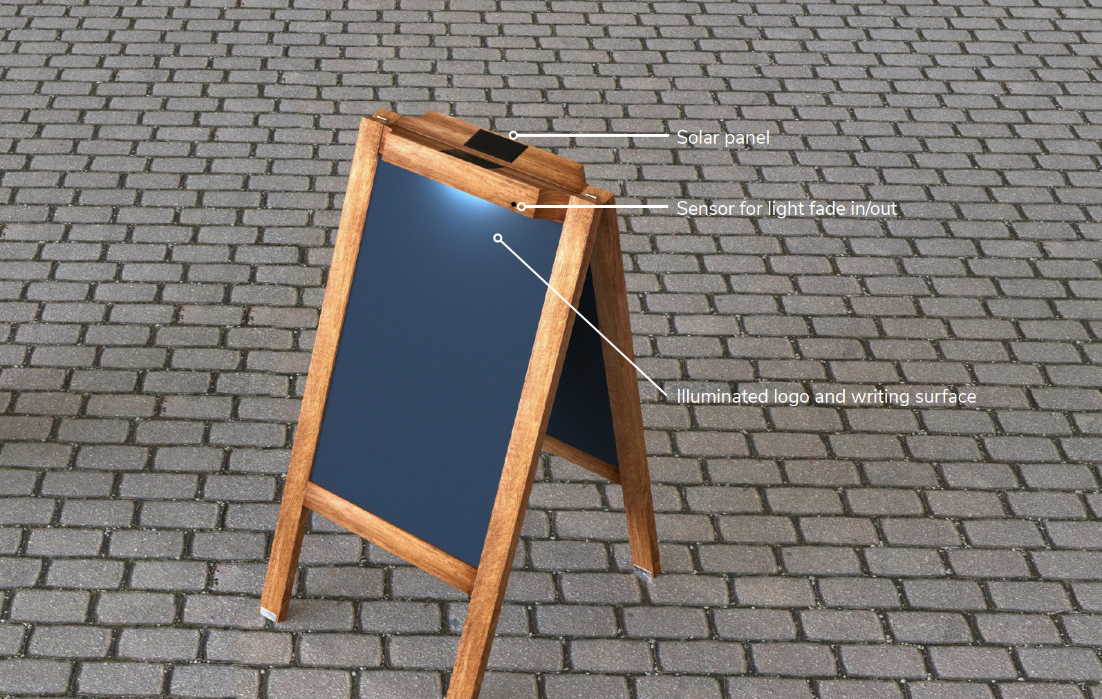
For example, LED lighting in digital displays can significantly reduce energy consumption compared to traditional fluorescent or neon lighting. Opting for signs made from eco-friendly materials such as recycled plastic or environmentally conscious materials like bamboo can also help reduce waste and carbon emissions. Other examples are using solar-powered lighting, which reduces the need for electricity from the grid (Check out the Solar Powered Pavement Stand here). Another example is incorporating greenery into the design, such as living walls or moss walls, which not only add a natural touch but also contribute to air purification.
 Dekkers Solar Powered Pavement Stand (example)
Finally, brands can also use modular signage systems for products that are easily disassembled and reused in different locations rather than creating new signs for each new campaign. Plus, designing signs that can be reused or repurposed is a great way to contribute to a circular economy.
Boost your outdoor signage in 2024 with these extras
Two more convincing 'do's' to consider for effective outdoor signage are to incorporate interactive elements and to consider the placement of the signage. Interactive elements like QR codes or touch screens can engage potential customers and provide additional information or a call to action.
Placement is also key to ensure maximum visibility and impact, so consider factors like height, angle, and distance from the target audience when designing the placement of the signage.
Another important consideration is to make sure the signage is accessible and visible to all potential customers, including those with disabilities. This can be achieved through features like braille, audio descriptions, and high-contrast colors.
In summary: Outdoor signage is here to stay as an effective way to increase visibility, portray information, or immerse pedestrians in the brand- or product experience. So, follow these three crucial do's and your outdoor signage will be effective, long-lasting, and eco-friendly. Happy sign-designing!


